Tuesday, 8 December 2015

Bauer Media Group

Bauer Media Group

Bauer Media Group is a European-based media company, in Hamburg, Germany that manages a portfolio of more than 600 magazines, over 400 digital products and 50 radio and TV stations around the world.

  • Bauer Media own magazines from Mojo to Grazia and Q to also owning Radio stations for Kiss, Magic and Heart Radio. The diversity of the company allows the brand to be expanded in different mass media platforms which permits their company to be as successful and well-established as they are now with the wide range of target audiences they perceive from the variety of digital platforms they consume.

Sunday, 25 October 2015

Questionnaire and The Results


Survey Monkey Results


The reason I did this survey was to find out what my target audience are interested in and what they want the magazine to include and look like. I have a range of results making me see a variety of different opinions, for each result I have collected I have made some into pie charts and the rest in bar charts.


Saturday, 24 October 2015

Photo Analysis for My Magazine

•In this picture of the model winking, I decided to add to my content page as the atmosphere in which she is in captures the true meaning of a working environment and also in her own working ethic which is rather calm and collected. By her facial expression on her face it shows a realistic view of teenagers today whilst working hard and enjoying the work their doing.
• In this image, I've captured the two students who are both working hard together and not distracting one another but pushing each other to carry on with their work. This picture from this angle didn't really show as much evidence towards their work and when trying to use it for my content page wouldn't work. However, this picture shows the committed atitude that every sixth form student show drive towards.
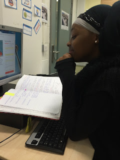
• These multiple pictures of a student on the computer and also, working in her book. The picture Shows us the other available resources to gather further information for her work and more help if she possibly doesn't understand.
This photograph shows the modern way of gathering information and completing any task set by using your laptops for your work. The quicker way and more effective manner to independently finish work on time and on your own desktop may encourage you to do the work even more, therefore I also added this image in my content page to emphasise the huge difference that our generation now have a huge range of resources to relay on. 

Friday, 23 October 2015

Working with Indesign


The official magazine cover:


The process behind In-design:


The first procedure I  need to do when I start to begin the In-design project is to gather the right measurements of your magazine that you will recreate and the right boarder margins which make your magazine stay in position.

My first In Design attempt:

(However, with another image)


Tuesday, 20 October 2015

Looking at Existing Magazines


These three magazines have similar fonts and layouts both with a very instinct masthead and lettering throughout the front of the magazine, however the first one the front is more stretched out and fits the whole page whereas the second magazine has a more bold typography lettering for the masthead. The house style and colour scheme for both magazine match the theme that there going for. With the CVI also in the middle of the front cover grabbing the attention of the readers and whilst also linking to the main cover lines.


Brand Eye: Choices

•  Audience: Teenagers ages 16+
•  Price: Free 
• Content: Different school addresses, Information about colleges and different aspects.
• Core Proposition: "College is a way to come together"
• Brand Personality: precised, friendly, lively, interactive 
• Target Readers: college / school students, parents 
• How does the magazine make me feel: - Part of the community  - Driven to achieve and have multiple choices in life.


Another Magazine which is more sophisticated.

This more formal and very different layout from the other  magazines I've discussed, the typography of this magazine is rather large and its masthead is more vibrant and visible with also, making the year the circle for the "i" makes the typography more combined and readable. The colour suits the idea of having a Phoenix to link towards the name and the colour goes with the concept, the lighter part within the middle of the text makes that area more eye catching and the main focus as each part with the brighter colour stands out more towards the audience. 

What I Find Useful About Technology

Technology is the collection of techniques, skills, methods and processes used in the production of goods or services or in the accomplishment of objectives, such as scientific investigation.


  • The different uses I have used for my research have all been internet based which has provided me with very useful and understanding points which I can develop on and make the information I have processed into my own knowledge when completing a piece of work.

  • The various uses of technology differ as some technology and gadgets help you to be successful in day to day life, where the information we gather helps us learn a little more each time. The way technology provides us with reassurance and guidance when we need it, it also helps us in life threatening scenarios whilst, improving our general intelligence at the same time.

Friday, 25 September 2015

Typography Quotations


Typography is the art and technique of arranging type to make written language legible, readable, and appealing when displayed.


Friday, 18 September 2015

Brand Eye

                                             Kraze! Magazine

Audience: Young 5-8 Year Old Boys Price: £3.99• Content: Games, Reviews, Colouring pages, Puzzles, Facts, Quizzes,• Core Proposition: "Video Games & Toys are a child's favourite thing"• Brand Personality: Gamers, Trendy, Interesting, Packed with activities, Enjoyable content for children to read, Exciting toys and cards.• Target Readers: Gamers, Toy collectors, Review hunters, Game facts • How does the magazine make me feel:  - The magazine makes me feel very intrigued into the facts provided and the games it contains.- The vibrant colours makes the magazine more appealing.- The magazine makes me feel positive as the colours reflect that mood.

~Magazine in packaging:

~ Magazine unwrapped from packaging & items opened from their boxes:


~ The front cover of the magazine:


Content within the magazine:


Another Brand Eye for Tatler:


-The front cover of the magazine:


-The Brand eye:


Sunday, 6 September 2015

Welcome!

Welcome to my blog for my AS media studies, where I will be creating a music magazine of any genre I want for my official task, whilst firstly by doing a preliminary task I will be examining a variety of different magazine styles and layouts to allow me to have a better understanding when making my own.